Trends exist everywhere. In mobile industry, in fashion, in cars industry and in web design too. For example, one year large mobile phones will be in trend and the other year people will laugh at you if you have one like that because small phones are popular that year. The same thing stands for web design too. One year detailed mega menus will be popular and the next year everyone will go for minimalistic menus. That’s the way it goes. The trends in web design changed a lot this year so it’s important to stay up-to-date. To know what’s good to use this year check out the rest of this article.
The IN’S
First we’ll start with what’s good. When you start doing some web design this year make sure to include one of these things if you can:
- Semi-flat design
- Custom-drawn illustrations
- Cinemagraph
- Storytelling
- Lazy loading
So, semi-flat design is the first thing to pay attention to. What is it actually? Flat design is fully minimalistic and simplistic style of design. It became popular few years ago and it’s used more and more in lots of technology areas. Biggest advantages of semi-flat design are the faster loading times, simple typography, structured layout and visual maturity. The reason why semi-flat design is so popular in 2016 is the shading, dynamic colors and simple typography. Shading is an easy way to add more depth and complexity to the whole design without having to sacrifice some minimalistic elements that are standard in flat style. Dynamic colors help with giving an energizing look to the page and helps with rectifying a dullness of some page or elements. Simple typography is good because it’s simple. I’s easy to read and people will love it.
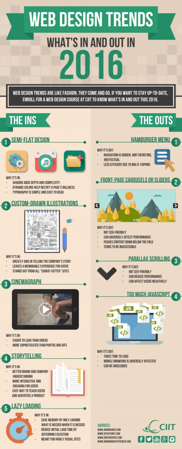
Another thing that is popular in 2016 are custom-drawn illustrations. Why? Well, illustration is a tool that can be extremely powerful and that can be used in various areas of design. Functions of illustrations in web design is to make a clear example of something and to provide some visual features needed to explain or decorate something. So, it’s clarifying and beautiful in the same time. It’s popular in 2016 because it helps a lot with telling the story of a company. You can easily explain everything about company history and what if offers with a simple drawn illustration. In that way users will have a great experience while reading (or looking) at it and that great and memorable experience is another reason why custom-drawn illustrations are so popular. And that will also make your website stand out among others.
Ever heard about cinemagraph? Maybe you didn’t and maybe you don’t even care. But you should care and you should use cinemagraph with your website. What is it? Cinemagraph is a collection of photos that are turned into short movie by combining them into an animated gif. The key with cinemagraph is to make the image look like a normal and static photo only with one part of image that moves. Cinemagraph is extremely cool and popular because it adds lots of new creativity options for photographers and designers to use and experiment with. Why is it so popular? Except for all the things I mentioned above, cinemagraph is popular with web designers because it adds better and more sophisticated look that simple photos and gifs while it’s much easier to load than videos. Few years ago web designers had to put videos if they wanted something better than photos and gifs but today we have cinemagraph.
Everyone likes a good story, right? Then why shouldn’t you use storytelling in web design? Storytelling is becoming more and more popular with web design because it helps with better understanding of company and brand and it’s much easier to explain your company and brand to the visitors. Another great advantage of storytelling is that it more interactive and engaging for the users. It is also much easier to teach users about something or advertise your products to them with a good storytelling.
The last big thing that is popular this year is the lazy loading. What is lazy loading? It the ability to specify which parts of web will be loaded. With lazy loading technique it is possible to load some of the web functions only when it’s needed. Some parts of website that are often loaded immediately after opening the page can be loaded only when user wants them to load. Some of the main benefits of lazy loading are faster connection of users to the content. Lower resources cost and higher customer retentions are also main benefits of lazy loading technique. It is also possible to save more memory and reduce initial loading tome of website. That is exactly why lazy loading technique is becoming more and more popular with web designers. But don’t forget that lazy loading technique won’t be much effective on some minimalistic websites that don’t even have lots of visual content. Lazy loading is mostly meant for highly visual websites.
The OUT’S
Now that I covered everything that you should use when creating some website and its design it is time to show you what you shouldn’t use. Some of the worst things you can do this year are:
- Hamburger menu
- Front-page carousels or sliders
- Parallax scrolling
- Too much JavaScript
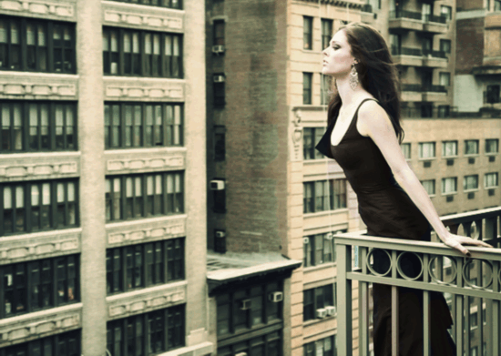
The first thing you should avoid is the hamburger menu. Why is it called “hamburger”? It’s called “hamburger” because it looks like a bun-meat-bun sandwich. People like to use hamburger sandwich because it hides the navigation and shows it only when people need it. It’s simple, when you click on it navigation will show up and in other times people won’t be bothered by it. Sounds great, right? You could be surprised if I tell you that hamburger menu is a bad idea. Some experts say that hamburger used as hamburger menu is made out of mystery meat. I won’t spend much time trying to explain why us hamburger menu a bad idea because some people like it so much that you simply can’t convince them not to use it. Simply don’t use it and you’ll be fine.
Another bad idea is to use front-page carousels or sliders. Why? Front-page sliders are not SEO friendly. SEO is one of the most important things with every website because without a good search engine optimization everything else will be completely useless. Front-page carousels may look good but it’ll do more harm than good to the complete website. Another bad thing about front-page carousels and sliders is the performance. Using them on website can affect the loading speed of a website and that is another thing that can harm both SEO and the mood of users. And remember how content is very important? Well, carousels and sliders pus the content down and makes it more inaccessible.
The third thing to avoid is parallax scrolling. Parallax scrolling is a technique of web design where web components can move at different speed when user scrolls the page. The main effect is created when the background moves different that the rest of elements. Why is it not wanted? Just like hamburger menus and front-page carousels and sliders, parallax scrolling is also SEO unfriendly. That is already enough for you to avoid parallax scrolling. Another reasons to avoid it is because it can reduce performance and can have negative effect on users.
And the last thing to avoid is JavaScript. Don’t avoid it completely but using too much JavaScript can ruin the whole concept of your website. Too much JavaScript can affect the loading time of your website and can be extremely unsecure.
So, what do you think? I hope this article helped you with your web design and I hope that your new pages in this year will be successful. For more useful information, check the infographic below. Good luck!