
The Year of Mobile is for several years in a row now. Consumer behavior has seriously outpaced marketer action when it comes to embracing mobile. We’ve reached a pretty stable state where roughly half of all emails are read on mobile devices. However, marketers still have a way to go to catch up, despite great strides over the past two years. Let’s check out some Mobile-Friendly Email & Landing Page Trends for 2015.
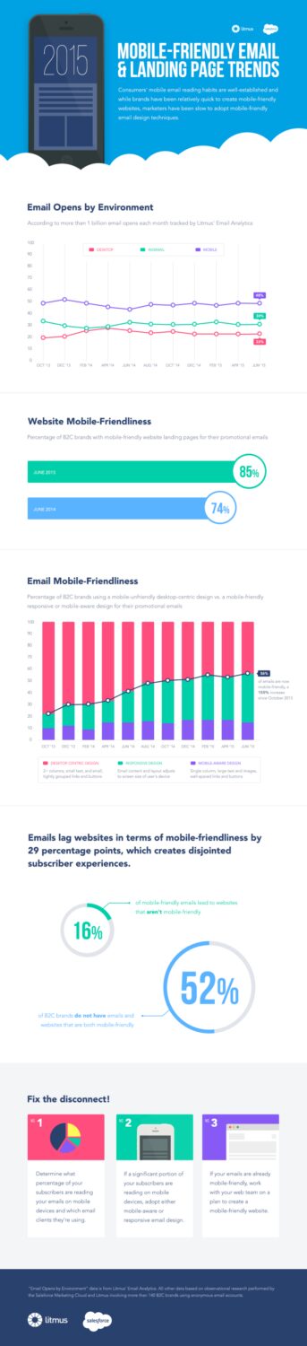
Mobile-Friendly Email & Landing Page Trends for 2015
According to Exact Target’s Mobile Behavior Report of 2014, consumers consider mobile an essential component of their every day lives and the average person spends around 3 hours a day on their smartphones and tablets.
Furthermore, the top three activities on mobile devices are email, texting and online search. Since consumers are becoming more dependent on mobile, it’s now up to businesses to take advantage of mobile marketing.Future of marketing in 2015 is to optimize mobile content marketing.
Mobile-Friendly Landing Page
You’ve only just finished developing your website for desktop and now you’ve realised your site sucks when viewed via mobile devices. So now, instead of creating a one-size-fits-all strategy for designing the layout of your website, you must consider how the site will appear when tested across a large range of devices with different screen sizes. This includes smartphones, desktop, tablets and beyond. Here are some tips on making your website easily accessible on mobile devices:
Don’t make a separate mobile-friendly website
In the past, when we designed websites for the “mobile web,” we would cut out content to fit for mobile use and argue which parts are more suitable for mobile. However, we can’t control what kind of content our users want, and we can’t say that mobile devices are so fundamentally different from our desktops that mobile has to have its own web space.
If Google penalizes us for duplicated content already, then having two websites, one for mobile and one for desktops, with the same content defeats the purpose of trying to show up on Google’s search engines. So you shouldn’t create a separate website for mobile.
Use responsive design
Responsive design allows website developers to create a site that will be easily viewable on different sizes of devices. This reduces the amount of work website developers have to do when it comes to creating a website.
The responsive design approach makes use of flexible layouts, flexible images, and cascading stylesheet media queries. When responsive design is used on a website, the web page will be able to detect the visitor’s screen size and orientation and change the layout accordingly.
Font sizes and button size matters
Your font size and button sizes matter a lot for mobile devices. For font size, it should be at least 14px. This may seem big, but instead of having your users zoom in to read your content, make it easier for them by adjusting your font size for maximum legibility. The only time you should be going smaller, to a minimum of 12px, is on labels or forms.
As for buttons, the bigger the button, the better. It reduces the chances that the user will miss it or hit the wrong button by mistake. For example, Apple’s design guidelines recommend button sizes to be at least 44px by 44px. Following these guidelines will help you maximize your user’s experience on their mobile device and increase conversions for e-commerce sites.
Use high-resolution images
Just like on Instagram, hi-resolution images are extremely important on your responsive websites to ensure your user’s experience is of a high standard. The latest models of iOS devices have high-definition screens that require an image double the resolution of a desktop. Having extremely high-resolution images will help you avoid having pixelated images when viewed on a retina-quality screen.
Never stop testing
Once you’ve created your responsive website, test it, test it for the second time, and then test it again. I don’t just mean “try it on one mobile device multiple times;” test it out on an iPhone, an Android, a Windows phone, and different tablets. Test every page, user action, buttons; and while you’re testing, it’s always important to put yourself in the position of the user, or ask someone who didn’t design it to test it for you.
Mobile-Friendly Email
Each time you send an email, you should be aware that a huge portion of your subscribers are going to open your message on their phones or tablets — not on their desktop computers or laptops.
Your job is to not only get your emails opened and read, but also to make your customers’ experiences just as strong as if the messages were opened on laptops or desktops.
A mobile responsive website design displays your content properly no matter how someone views your website, and you can ensure that the emails you send look great as well, whether or not you have a mobile-responsive email template. Here are some tips for transforming your message into a mobile-friendly email.
Compose short subject lines
Even though some email clients will display your entire subject line text, many do not. The solution is to either keep your subject line short, 40 characters or less is a good rule of thumb, or position the most important phrase of your subject line in the first 40 characters to maximize your chances of readers seeing it.
Use a single-column template
On a mobile-device screen, multiple columns typically appear condensed and confusing to navigate. A single column makes your email cross-device compatible and straightforward even when it’s viewed with different email clients. Single columns can also simplify your design and spotlight your important content.
Keep your email under 600 pixels wide
While most modern mobile devices can handle responsive designs, there are exceptions. When your email width is 600 pixels or less, users won’t have problems viewing emails that were formatted for large computer screens. Set a width attribute in your email template’s table tag to 600 pixels or use the CSS width property to make this adjustment.
Use a large font size
Since a 10-pixel font is difficult to read on a desktop computer screen, and small screens make small fonts even smaller, most people will delete your email before they’ll squint and strain their eyes in order to read your tiny text. A font size of 13 or 14 pixels makes your email substantially more readable on a small screen. But don’t be afraid to go even larger than that. Large fonts make your emails easier to read on both desktops and mobile devices.
Display small images
Smaller images reduce load times and bandwidth. Many mobile users still use 3G or slower, connections, so the speed at which images load is vital. If you have technical chops, or know someone who can help you, use responsive-coding techniques to load smaller images on mobile devices and larger ones on other devices. Another option is to shrink an image by 50 percent and compress it at a slightly higher compression rate than normal to both load your images faster and conserve your user’s bandwidth.
I hope you found this tips useful and that you will apply them in your business. This infographic summarizes our findings, highlighting the gap between consumer adoption of mobile and marketer adoption of mobile-friendly email and landing page design, and provides advice on how to close that gap.