You have created a new, attractive website, with modern design and a lot of useful content. Everything seems like it should be, but why website not generate more customers?
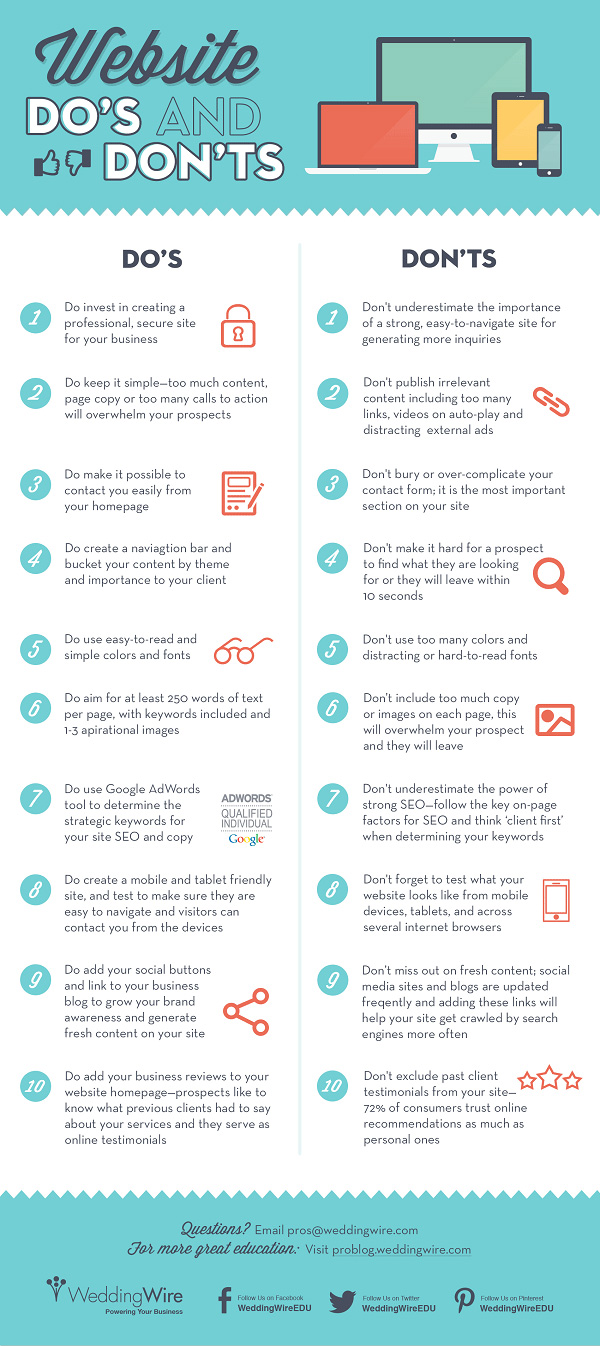
There are many requirements and conditions with wich the website must comply with, for start we will highlight the three main components of a successful performance of the website, and below you can see infographic showing 10 Small Business Website Do’s and Don’ts.
1. Web structure
Web structure can be seen as the foundation of web design, and the importance of a good foundation can be applied to almost everything in life. If the foundations are not set properly, anything above that is very easy to crash. The foundation website is a web structure or the positioning of all the elements of a website.
Visibility. All important information, important functions and calls to action (purchase, subscription …) must be at the top, ie. Visible without the need to scroll down. On the home page the visitor should get the answers to these questions: Where am I? What can you find here? What can I do on this page? How can I find specific information?
White space. Do not shy away from empty space. It is the white space between the content and images that allows your site to “breathe”. The optimum distance of content, more white space, will give the page a more sophisticated look, breathable and easier to use.
Visual identity. The most important elements such as logo, navigation, search, etc., should be displayed in a consistent way – always in the same place on the page and visually equally.
Less is more. A lot of information bother visitors and makes difficult to navigate the site. The more useful information in less text is the golden rule of the creating a web site!
2. Web design
A good web design is what can distinguish you from the competition and can run your business. Modern, airy and visually attractive site will surely leave a positive impression in every visitor. Insteade writing advice what you should haveon the site, we will write what you should avoid. These are some of the most common mistakes:
Low quality. We live in a highly visual and sensible age, and anything that is not top quality will cause a negative user experience.
Font and font size. The use of unusual fonts may be contributing to the exotic touch of your site, but it is possible that some systems do not support it and then the text will look unprofessional. And not to mention the size of the font. You realize that people do not carry the microscope always with them, so you should be careful when choosing fonts for your web.
The use of “dead” links. These are links that do not lead anywhere, but show error page or a “Page Not Found.”
Excessive use of animation. How is sometimes charming, to much of it can be irritating.
3. Functionality
The visitor must be able to perform the activity for which he had visited the site, whether it was a purchase, sign the newsletter, request additional information … all the elements must be functional, every page and every button has to be correct. You should regularly check the functionality of the site!
There are still many details that need to be incorporated into the site to be successful, but this segments are the basis to web function properly. So below you can check out the infographics with do’s and dont’s for small business website: