People love to see images. People are visual creatures. And this is backed by research. Bloggers from HubSpot came across the fact that 40 percent of people more response to visual content that is offered to them than the text. And what’s the best visual content? Infographic. Statistics show that those who published infographic in his media recorded 12 percent more traffic than those who do not publish.
Each infographic has to look attractive and contain ‘pure’ design and readable typeface. Each reader must be able to analyze and understand the presented data. Infographics can be on any subject: time, marketing or the environment, and include graphs, pictures, diagrams, text, timelines, various lists … We can say that infographics are digital mental maps. They facilitate learning and informing, but also reduce the cost of advertising because it can be shared on Internet (social networks).
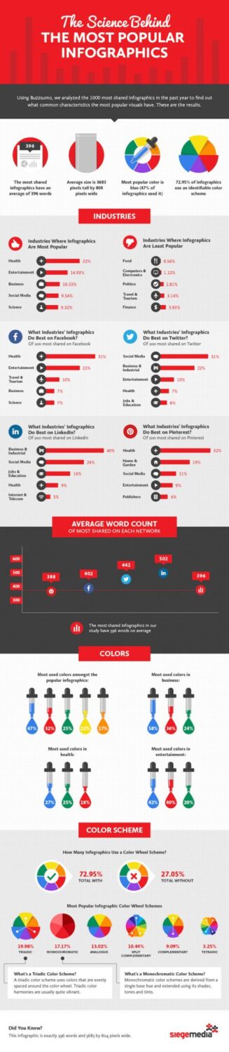
Infographic must have a catchy title and a current or an interesting topic for the presentation of visual information. You must have a good quality of statistical data. To some infographics be successful you have to share it through social networks to make it easier for readers to connect with a company, product or something similar. When designing it is necessary to avoid a white background and a large amount of text. To learn more about the science of the most popular infographics and c, check out the infographic below from Siege Media: