
For years we hear stories about the vast amount of information that will overwhelm us when it comes to life next generation. We hear about how this information should be faster and more qualitative analyzed in order to understand them and pulled them out of a variety of insights on the basis of which we will realize a life or business opportunity. However, we must ask what is in the data, regardless of their amount, essentially, or at least, new? How can we find out?
Data analysis in business is performed by some software for business intelligence, and these are tools that require a lot of knowledge of the information technology. However, if you are in the position of a man who has to quickly make business decisions – you need more modern methods, and that is, in two words – data visualization. This is an interactive infographic, and presentations in which the information display and connect a series of files in a way that gives them a new value.
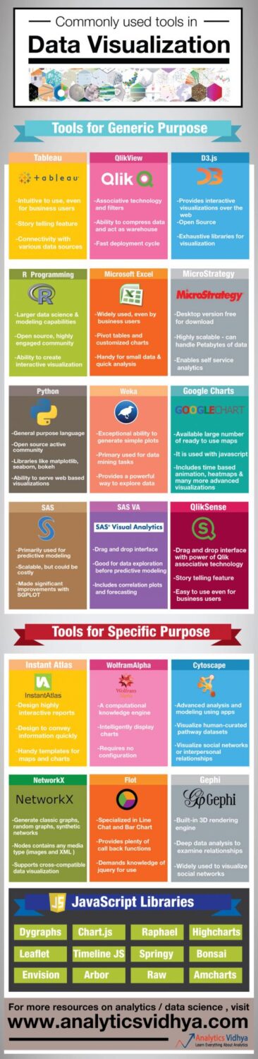
The point is simple: people understand the pictures faster and better, rather than words, and then act quickly. You do not need to know math to understand what you see. In addition, a good illustration of the data makes people focus on the essential – the value of data and insights that it brings. To help you visualize your data in the best way, below we bring infographic with the best tools for data visualization, check it out:


")


