
Do you know how many people use their mobile phones to access internet and websites? You probably don’t and we don’t know the exact number too but I can say that that number is high enough for you to consider making a mobile website. It is not enough just to create mobile website, you have to make it look good and optimize it well. How? Keep reading to find out.
Few years ago people were maybe laughing to people who designed mobile websites. And today? We could say that having a website that can’t be perfectly used with mobile phones is a killer for your business. Still think that you don’t need mobile website? Well, think again. Smartphones are becoming cheaper and cheaper and almost everyone can afford it today and like you already know, those devices are great for browsing. Another reason for getting a mobile website is a competition. If a customer comes to your site via mobile phone and sees that it is not optimized for it they will most likely go to the service that provides support for their phone, and you don’t want to lose potential customers. And did you know that having a mobile friendly website can increase your SEO ranking on Google, Yahoo and other search engines? Finally, a good mobile website will surely increase user experience for visitors.
So, now you realize why you must have mobile website? Good, but how to make it? Creating a perfect mobile website can be pretty hard, especially if you are new to that field. To help you with that I will list some elements of mobile website that are probably the most important ones.
- Content – I think this one is pretty obvious, interesting and attractive content is a must for any website. But when creating mobile website you have to understand that content show a lot different on desktop or laptop than it is on mobile website. Test your website and make sure that everything is perfectly seen on mobile phone. But really everything, from font and images to simple formatting and spacing.
- Design – design is another thing that is a lot different on mobile website than it is on usual desktop version. User interface must be optimized for devices with smaller screens but you still have to keep the whole structure together and keep it simple.
- CTA – your call to actions links or buttons must be visible. The main goal of your website must be to accomplish something and to convert leads. Change the color of that button or form, make it bold or italic or put it into some different and unique font so it can stand out.
- Functionality – your mobile website must be very simple and clean. It has to be minimalistic but its functionality must be perfect even if you are creating some complex website.
- Experience – you have to learn something about your audience and understand what they want. Once you get that you will be able to organize your whole mobile website on the right way and make it attractive.
When you learn what all the elements are you should know how to optimize them and what to do to create minimal distractions from the main content. To do that you should:
- Create a simple layout – if your users can’t easily find the thing they are looking for then they will search for that somewhere else. Add whitespace to layout and place all the elements on the right place and on the right way.
- Hierarchy – to minimize the whole mobile website you should make sure that you put all the tittles in bold font, keywords also in bold or italic and all the other stuff that should be easily visible.
- Consistency – be consistent! For example, if you use different color for every element then it won’t look good and visitors surely won’t be happy. Use the same color for every tittle, same for every CTA button and same colors for all other elements that are similar.
- Writing – if the content isn’t interesting then all the optimization and good design is useless. Check your grammar before you publish something, use short phrases and similar.
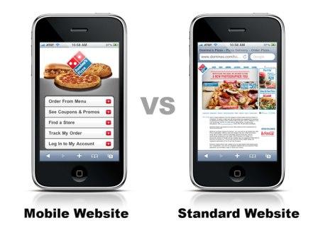
Mobile website vs mobile app

A lot of people mistake mobile website with mobile apps. That is not the same and you must learn the difference because it is important to know if you need mobile website or mobile app.
Just like I already mentioned, mobile website is a site designed for smartphones and tablets with smaller screens. Mobile websites can be accessed with any mobile browser. When users visit your address website will automatically redirect them to mobile version.
On the other hand, mobile app is an application for smartphones and tablets. Mobile app must be installed on phone first so it can be used. Most of mobile apps can be downloaded from official stores like Google Play or Apple App Store.
Mobile website design mistakes
If you are doing something for the first time (or sometimes for tenth, doesn’t matter) you can still make some mistakes in your work. The exact same thing will happen to you if you create mobile websites. But if you learn what those mistakes are before you start creating your own mobile website it should be easier to you to avoid them and create better site. So, what are those mistakes that lots of people are doing? Check below.
- Blocking JavaScript , CSS or media
There are a lots of users who block access of Google search crawler to their JavaScript files, CSS or some media files. That can lead to a big mistake sometimes. Your website on desktop could look perfect, but mobile version of your site could be ruined because Google didn’t get the access to some files and therefore didn’t index it so it is not working.
- 404 error
All your desktop URL’s should lead to mobile URLs. There shouldn’t be any wrong redirect because it will lead to unhappy visitors and bad SEO. The big mistake lots of people make is that they don’t redirect those URL’s and then visitors get 404 error. For example, desktop version of yoursite.com/movie should not lead to yoursite.com/movie on mobile version because then it would show 404 error. Instead visitors should be redirected to m.yoursite.com/movie.
- Slow pages
Another big mistake lot of people make is to ignore loading time of the page on mobile phone. If you go to some website (on desktop computer) and it is loading very slow do you like that? Of course not, and the same thing stands for mobile websites too. You can test the page speed on lots of free online services so go ahead and do it. If it’s not good optimized the page and make it faster.
- Touch
Lots of people forget about touch. Almost every mobile device is a touchscreen phone today and some of the laptops are touchscreen too. If you want to design a mobile website you must realize that some elements must be optimized for touchscreen devices. If you put links or buttons too close to each other or to small then how should people click on it?
- Menus
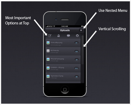
And the last thing I want to talk about are menus. Menus are another thing that must be responsive and optimized. Menus must be kept short, easy to use and should be placed on the right position on the page.
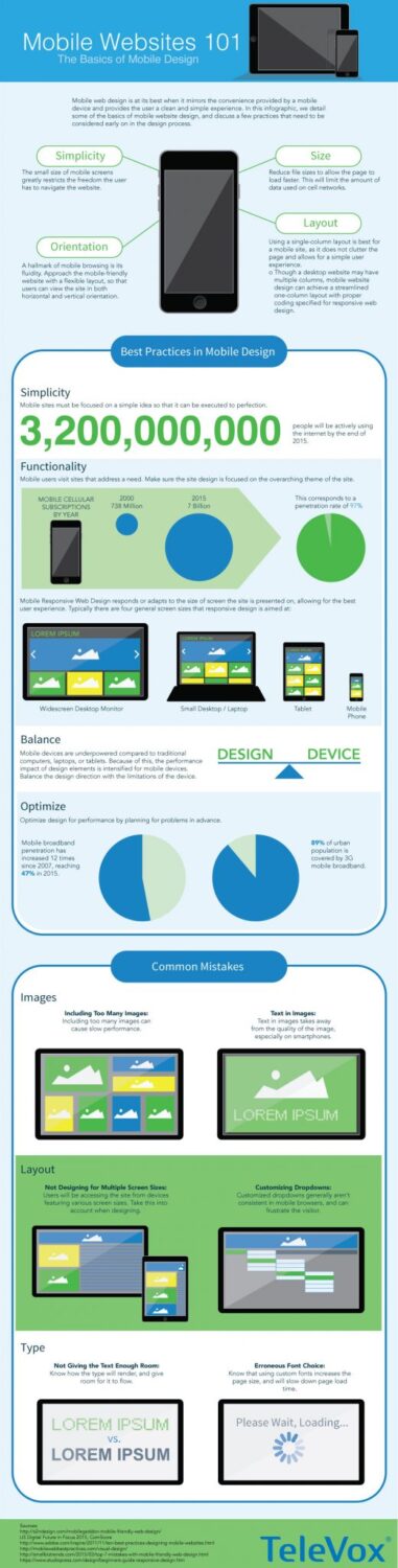
And that’s it, you can find more details and statistics about mobile website in the infographic below. Enjoy!