
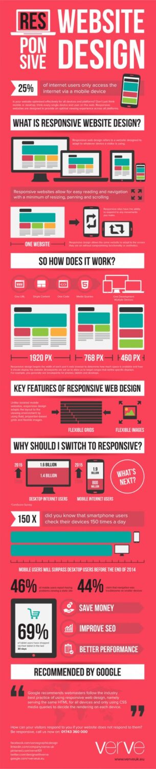
How many times did you see websites bragging about their responsive design? Or some website themes which include responsive design? And professional web designers from the BizOP team who offer fully responsive design for your site. You’ve probably seen that a lot, but have you ever wondered what responsive web design is? Well, we could call that a technique of web design or web apps that react on different devices or web browsers used to visit a site or app.
There are more styles for different screen sizes so the website or app looks good on every screen. Try it yourself. For example, if you resize your browser window on our site you will see that it will shrink and still look good. When it first appeared it was a trend, but soon enough responsive web design became standard in web development and web design.
Advantage of responsive web design
As I already mentioned, responsive web pages allow web developers to build sites which will have exactly the same content but will fit on different device or screen format. The old way of optimizing websites for mobile devices required a subdomain that was used to build design for mobile devices and a script that was responsible for finding out the type of device used to access the website. When you visit some website with your phone or tablet sometimes you will be redirected to a mobile subdomain (mostly m.domain.com or mobile.domain.com). But that means that owner will have to update two separate sites which can cause problems. That is one of the main advantages of responsive web design. Here are some of the biggest advantages of responsive web design:
- Money – instead of paying for one site the owner will have to pay only for creating one site. There is also a need for support of only one website so the monthly cost is also smaller.
- Time – as you can guess when you have a responsive website you have to publish content for only one site. You don’t have to publish another article for the mobile version of the site.
- SEO – user interaction is easier, just like interaction with Google algorithm and Google crawler. You will just have one URL to optimize too.
- Visitors – when you have responsive web design it means that people who visit the site from different smartphones or tablets will automatically have perfectly designed site for their phone. Navigating through the site will be much easier and visitors will buy your product or use services more likely.
Perfect responsive web design features
Now that you know what is a responsive web design and what are the main benefits of it you should know what are the features of a perfectly designed responsive website. A responsive website should offer a smooth user experience. Users should feel perfectly safe and satisfied when browsing through a responsive website. Another great feature is statistics. A good responsive website will have its statistics divided into two parts, one for visitors from PC, laptop and similar and one from visitors who use smartphones and tablets.
The great thing about a website with a responsive design is that it is fully user friendly. This kind of design makes the site perfectly good on any device with any screen size. There is a large number of tablets and smartphones on the market and it is important that the website looks good on each one of them. Search engines are starting to like websites with responsive design more and more which means that responsive websites get a good SEO advantage over other ones. Something that every responsive website should have is the option to resize videos, animations, and images with the website itself. There are lots of other, less important, features of the responsive website but this should be enough for you. Now it’s time to present some great websites with responsive design.
Examples of great responsive design
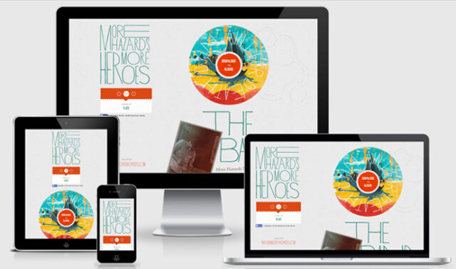
- More Hazards
Great website with minimalist responsive web design which makes this website look perfect on any device.
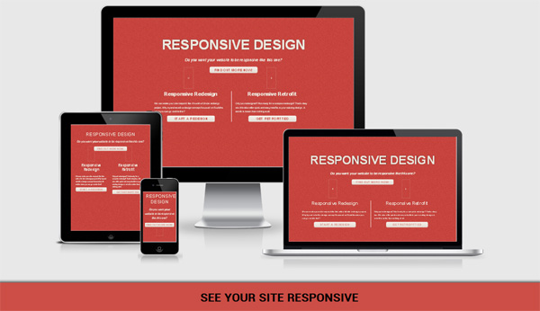
Nice website with great responsive design and touch-friendly interface.

MRY is a cool website with animations and bold colors. The mobile site is also good looking with simple navigation and a nice scroll button.

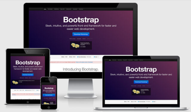
Twitter Bootstrap is a website that offers web developers a responsive framework for easier web development.
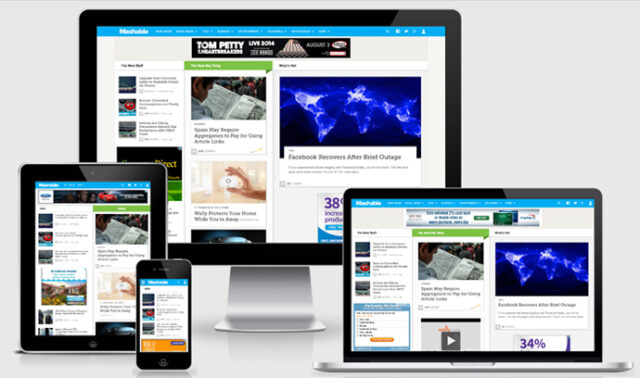
The last site on my list is a website called Mashable. It has a simple responsive design with nice social buttons and smooth navigation.
I could add a large number of other sites to the list but I feel that is it not needed, you get what I mean. These are 5 websites with working responsive design and their visitors love them.
Should you switch to responsive?
Based on all I mentioned above you can’t wait to make your site responsive, right? But the real question is, should you make it responsive? There are lots of ways to find out, and I will help you with that. To decide if you need responsive design you should ask yourself a few questions.
- Do you need a responsive design?
If you have a normal website with normal design and, probably, on other domain for mobile phone users you must ask yourself do you really need a full change of looks and code to make the website responsive? Good way to figure out this is to use Google Analytics tool and find out how your visitors access the website. If most of the users come to the site via desktop or laptop computer and use mostly the same screen resolution then there is no point of wasting time and money to make your website responsive.
- Knowledge? Money?
If you still want to make it responsive after the first question then you should ask yourself if you have the knowledge to design that or the money to pay someone to do it. If not, then how will you do that? Designing a responsive website can be very hard and complex and it is not easy to learn. Luckily there are some tools and frameworks that can help you with that but you still can’t make it work if you don’t know anything about it. Good luck with that!
- Testing?
So, you decided that you need responsive design and you can design it yourself or pay someone? Great, but can you test it? It is not a good solution to publish the website without testing it on different devices with different screen sizes. You must test it yourself and see if it works perfectly.
- Limitations?
Responsive design is not built on some subdomain and that kind of design doesn’t use a completely different code that can be easily edited. Responsive web design uses the same code but with some tools like JavaScript and CSS Media Queries to adapt to different devices, resolutions, and screen sizes. So you can expect some limitations on the website look on some devices.
And with that, I will finish this article. I hope you learned something new about responsive design and maybe even decided to make your site responsive. In the infographic below you can also find some of the most important things about responsive design. Feel free to brag with your responsive website in the comments below. Who knows, maybe I will add it to the list here, and if you read the article about SEO you know much a good backlink is worth 🙂


")


